Rendering Memory: A Visual Study of Bovenbouw’s Reconversion of Hasselt Beguinage
- Vladyslav Alyeksyenko
- Jun 8
- 12 min read

There are some architectural projects that ask for a clean, beautiful render.
And then there are projects that make you slow down.
Bovenbouw’s reconversion of the Hasselt Beguinage belongs to the second category. It is not a project that can be reduced to a nice courtyard, a renovated ruin, or a new tower placed in a historic setting. The more I looked at it, the more it felt like a project about time: what remains, what disappears, what can be repaired, and what can be brought back to life without turning history into decoration.
That is why I chose it for this visualization study.
The goal was not to reproduce the official photography, and certainly not to create an alternative “official” version of the project. This was a personal study: a way to look at the architecture, rebuild enough of it to understand its logic, and then test several visual moments that could express the atmosphere of the place.
Architecture: Bovenbouw Architectuur
Project: Reconversion of Hasselt Beguinage, Hasselt, Belgium
Visualization study: ZenViz Studio
Unofficial personal study - not commissioned by or affiliated with Bovenbouw Architectuur.
Why this project
The Hasselt Beguinage is already an interesting place before the contemporary intervention enters the picture. A beguinage is not just a courtyard with old buildings around it. It carries a specific social and religious history: enclosed, domestic, quiet, protected from the city and yet deeply connected to it.
Bovenbouw’s project works with that condition very carefully.
The site is opened again as a public garden. The historic dwellings are adapted for academic life. The footprint of the former church becomes a reflecting pool. A new belvedere tower rises above the enclosure, restoring a vertical presence to the site without pretending to be the lost church.
That combination immediately gives you several layers to work with visually:
the religious memory of the place,
the ruined church,
the reflecting pool,
the public garden,
the contemporary university life,
the new tower,
the old brick and stone,
the trees,
and the strange silence between all of these things.
This is the kind of project where the render should not scream.
It should listen.
Starting from structure, not atmosphere
With a project like this, the temptation is to start with mood immediately.
Old brick, autumn trees, water reflections, a tower in the background - you can already imagine the image before building anything. But that is dangerous. If the atmosphere arrives before the structure, the image becomes decorative too quickly. It may look nice, but it will not really understand the project.
So I started with the site logic.
The first step was to translate the available plan and axonometric information into a simplified 3D base. Not a perfect reconstruction, not a BIM model, but enough to hold the important relationships: the courtyard, the ruin, the paths, the surrounding buildings, the tower, the main direction of views, and the areas where later images could be composed.


This part matters because AI can add texture, mood, vegetation, and detail very quickly. But it cannot be trusted to invent the architectural logic for you. At least not if the goal is a professional architectural image rather than a pretty hallucination.
The 3D model was the anchor.
Everything else had to respect it.
The tower as a new marker
The belvedere tower became one of the key elements of the study.
It would have been easy to treat it as a simple vertical background object: build a shaft, add brick material, put a light inside, move on. But in this project, the tower has a more delicate role. It is a contemporary marker inside a historic enclosure. It restores a sense of vertical orientation that the lost church once gave to the site, but it does not imitate the church. It does use the same brick material and it's pattern, but that seems to be more of way to establish a relation rather than direct lineage.
That tension is interesting.
The tower had to feel new, but not alien. Present, but not aggressive. It had to read as a confident contemporary intervention while still belonging to the brick world around it.
I started with the basic tower volume and then developed the geometry step by step: the hexagonal shaft, the cut-outs, the internal presence, the upper belvedere, and its relationship with the surrounding buildings.
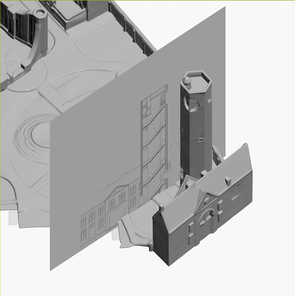


This process was not about obsessing over every construction detail. It was about giving the tower enough architectural logic to survive the final image.
Because once the lighting, vegetation, and people are added, weak geometry becomes very obvious. A tower that looks acceptable in clay can fall apart completely in a final render if its proportions, openings, or material rhythm are not convincing.
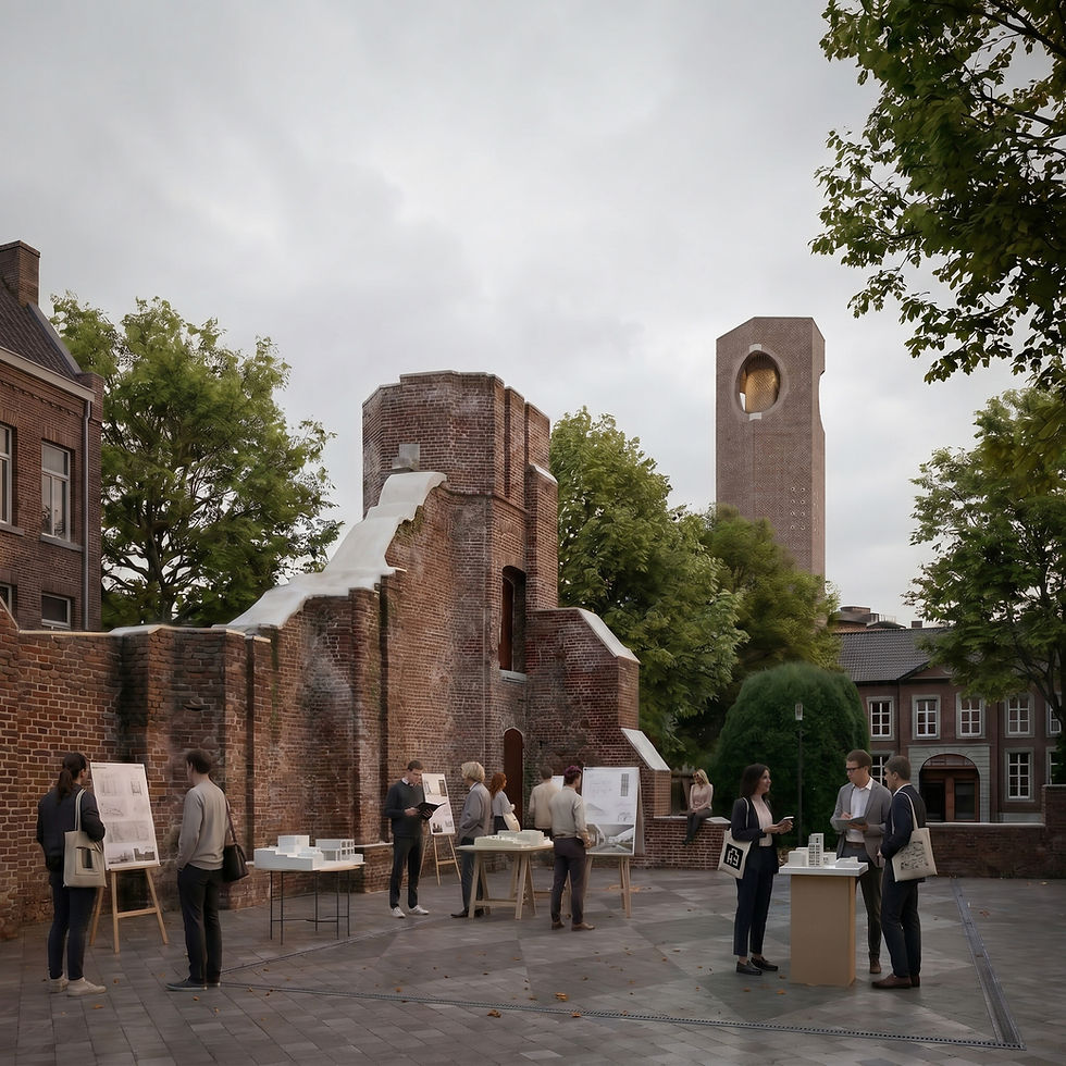
Image 1: academic life in the ruin
The first final image became an end-of-year architecture student gathering.

This felt like the most natural way to inhabit the site.
Bovenbouw’s project brings academic life into the former beguinage, and the church footprint can become more than a ruin. It can become a public room. So instead of filling the space with generic people, I imagined a calm end-of-year review or exhibition: students, tutors, presentation boards, models, quiet conversations, people standing around after a long day of looking at drawings and pretending they are not exhausted.
I wanted the scene to feel active but not noisy.
There is a difference between populating an image and giving it life. Populating is just adding bodies. Giving life means understanding what kind of activity belongs there, what time of day it might happen, what objects support it, and how much human presence the architecture can handle before the image becomes about people instead of space.
In this case, the gathering had to remain modest. The ruin, brick, tower, and courtyard still needed to carry the image.
There was also an alternative evening version.

This version is more vibrant, more dramatic, and probably less restrained than an architect might choose for the main presentation. But I still find it useful. It tests the same scene under a more cinematic light, with stronger contrast and a warmer sky.
Would I lead with it in an email to the architects? Probably not.
Would I keep it in the study? Hell yes.
Sometimes an alternate light study reveals what the calmer image is choosing not to do. The overcast version is more controlled and architectural. The evening version is more emotional and public-facing. Both say something, but they speak to different audiences.
Image 2: the beguine as a quiet historical echo
The second image looks toward the church ruin from one of the main entrances to the site. The tower stands to the right, the path pulls the eye forward, and a single beguine figure appears in the garden.

This image was the easiest one to ruin.
The beguine figure could very quickly become theatrical: too close, too large, too much like a costume, too ghostly, too symbolic in the worst possible way. I wanted the opposite.
She had to be small. Almost secondary.
A modest dark dress, a simple white head covering, a quiet presence. Not a nun from a film set. Not a ghost. Not a mystical character announcing the theme of the image with a hammer.
More like a memory of the site’s former life, visible only because the viewer happened to look slowly enough.
I also chose an autumn setting for this view. It gives the image a sense of time without becoming sentimental. Fallen leaves, muted vegetation, old brick, damp stone, and the heavy trunk in the foreground help the scene feel grounded. This is where architectural visualization gets very close to photography for me. The building is important, of course, but the image only works if the surrounding world has enough weight.
I have written before about how good architectural photographers often let buildings breathe inside their context. They do not always chase the cleanest, most exposed view. Sometimes a tree, a shadow, a figure, or a piece of foreground can tell you more about the place than a perfectly unobstructed elevation.
That was the intention here.
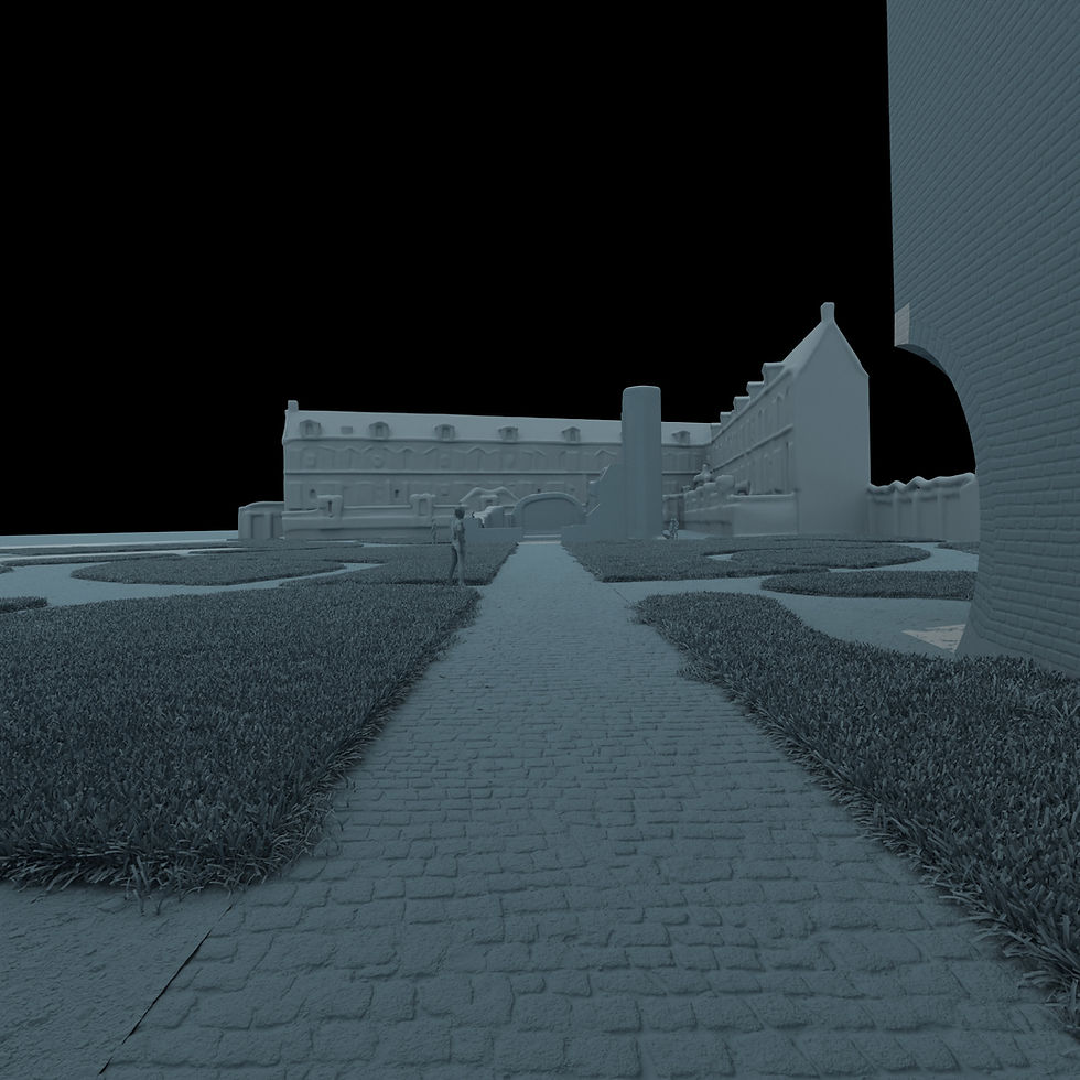
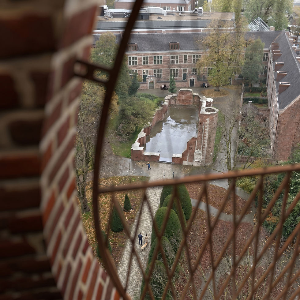
Image 3: looking from the tower
The third image reverses the relationship.
Instead of looking at the tower, we look from it.

This was an important image because it treats the tower not only as an object, but as an experience.
The view is seen through the railing. The foreground is intentionally blurred. The site is below, slightly wet from past rain, with the former church footprint visible as a reflective surface inside the garden. The image is not trying to show everything with perfect clarity. It is about the act of looking.
This is also where the project becomes more urban.
From above, the beguinage is not just a collection of beautiful fragments. You understand it as an enclosure, a garden in the city, a piece of historic fabric surrounded by contemporary Hasselt. The tower becomes a way to read the site again and that idea mattered to me.
A tower should not only be rendered from the outside. If its purpose is to offer a new view, then the image series should include that view.
The past rain helped the atmosphere. Not a dramatic storm, not cinematic puddles everywhere, but enough wetness to give the paving, vegetation, and reflecting pool a more tactile presence. Wet surfaces can easily become a cheap trick in archviz, but when handled carefully they can do something useful: they make materials speak.
Brick becomes heavier. Stone becomes darker. Reflections become more fragile. The whole site feels like it has weather.
And weather is one of the things that makes architecture feel less like an object and more like a place.
Image 4: reflection as memory
The fourth image is the most conceptual one.

The reflecting pool is already one of the strongest ideas in the project. It occupies the footprint of the former church and turns absence into a spatial experience. So I wanted to push that idea visually.
The camera is low, almost at the water level. Above the water, we see the present state of the ruin, the tower, the autumn trees, the brick, and the overcast sky. In the water, the reflection starts to behave differently. It suggests the memory of the former church interior: pale walls, tall openings, a door, a lost nave.
Not as a perfect reconstruction.
Not as fantasy.
More like a memory the water cannot quite hold still.
This image went through several tests because the concept is risky. The moment the reflection becomes too literal, it turns into a trick. If the reflected church looks too sharp, it feels pasted. If it glows, it becomes supernatural. If the beguine becomes too obvious, it becomes illustration.
The goal was to keep it architectural.
The past had to appear only through reflection, distorted and softened by the pool. It should feel like the site remembering itself, not like someone opened a portal to the 18th century.
The idea I did not use: Virga Jesse
At one point, I considered making one image around a post-Virga Jesse moment.
Hasselt’s Virga Jesse festivities are locally important, and they could have given the study a very specific civic and religious layer. The idea was not to create a full procession, but rather the aftermath: a few people crossing the beguinage after the celebration, flowers, light clothing, small traces of a public ritual.
In the end, I decided not to make that image.
Not because the idea was weak. Actually, I still think it could work. But for this particular series, it started to pull the focus too far toward event illustration. The student gathering already gave the site a convincing contemporary use. The beguine figure already brought in the historical layer. The reflection image already dealt with religious memory.
Adding Virga Jesse risked saying too much.
Sometimes the right decision is not adding the next good idea.
It is leaving enough space for the existing ones to breathe.
Materials, vegetation, and not making everything too clean
One of the things I kept fighting throughout this study was cleanliness.
Architectural renders often die when they become too clean. I do not mean minimal. Minimal can be beautiful. I mean sterile: surfaces with no age, vegetation with no randomness, brick with no weight, stone with no weathering, paths with no leaves, water with no subtle imperfection.
This project needed the opposite.
The brick had to feel old but not abandoned. The new tower had to feel precise but not sterile. The garden had to feel maintained but not fake. The autumn setting had to be present without turning the image into a postcard of orange trees screaming “seasonal atmosphere” at the viewer.
The real challenge was balance.
Too little detail, and the image looks like a concept render.
Too much detail, and the architecture gets buried.
This is where AI-assisted post-production was useful, but also dangerous. It can add richness quickly, but it also loves to overdo things or hallucinate heavily. It can make every tree dramatic, every surface shiny, every sky poetic, every person too important, every brick a heroic brick with its own personal journey - "from clay quarry to a perfectly shaped geometric unit in the tower that holds a weight of the world".
That is not always helpful.
The process became a matter of constant correction: add realism, then remove drama. Add vegetation, then reduce noise. Add people, then make them smaller. Add reflections, then make them quieter. Improve materials, but do not let them redesign the architecture.
A good image is not always the result of adding more.
Very often it is the result of knowing when to stop. I hope I managed that well.
What was 3D, what was AI, and what was judgment
I will include clay renders for the final images because I think this is important.
With AI-assisted visualization, there is now a trust problem. A beautiful image alone does not tell you enough anymore. It may represent days of modelling, lighting, and careful post-production. Or it may be a lucky prompt. From the outside, the difference is not always obvious.
So the structure underneath matters.
The 3D work established:
the site layout,
the tower position and scale,
the ruin footprint,
the surrounding masses,
the garden geometry,
the main cameras,
the basic spatial relationships.
AI-assisted tools helped with:
material richness,
vegetation complexity,
atmospheric refinement,
background realism,
some figure and entourage passes,
and selected conceptual details, especially in the reflection image.
But the real work was not choosing between “3D” and “AI.”
The real work was deciding what must remain fixed and what can be allowed to evolve.
That is the main question in hybrid archviz now.
If everything is fixed, the process can become slow and expensive.
If everything is flexible, the image becomes untrustworthy and fake.
The useful territory is in between: enough 3D control to preserve architectural logic, enough AI flexibility to accelerate atmosphere and detail, and enough human judgment to prevent the whole thing from turning into polished nonsense. Of course, in this visual study I had to compromise - after all I am not getting any money from it and spending 30+ hours and a lot of AI generative credits on a side project is quite pricey, so, I had to make shortcuts for sake of my own sanity and economical considerations. So, forgive me Bovenbouw team if the brick pattern is not completely precise (I know it isn't) and if the tree placement is sometimes faked or from a different time period (Most likely it is) or if the reflected church from the past is not exactly how it looked in reality (most likely not, I only found old exterior photos of the church and no interior). I am aware of those shortcomings but also confident that if given a proper job on this project, I would address those issues with due diligence and not make such a shortcuts and do a faithful representation of the projects idea.


What I learned from this study
This project reminded me that architectural visualization is not only about making a building look attractive.
Sometimes it is about making relationships visible.
Past and present.
Ruin and garden.
Tower and enclosure.
Academic life and religious memory.
Water and absence.
Repair and new use.
The best image in a project like this is not necessarily the one with the most spectacular lighting or the most complicated geometry. It is the one that understands what the architecture is trying to do.
That was the point of the study.
Not to replace the architect’s own imagery. Not to make an official reconstruction. Not to pretend I know the site better than the people who designed it.
The goal was simpler: to take an existing architectural project, study it carefully, rebuild enough of it to understand its spatial logic, and then use visualization to test how its atmosphere could be communicated through different moments.
A student gathering.
A quiet historical figure.
A view from the tower.
A reflected memory of the church.
Four images, four readings of the same place.
And that is what I like most about this kind of work. A render does not have to be just a final marketing object. It can also be a way of thinking through architecture.
Handled carefully, visualization becomes less about surface and more about attention.
And attention is usually where good images begin.
Credits and disclaimer
Architecture: Bovenbouw Architectuur
Project: Reconversion of Hasselt Beguinage, Hasselt, Belgium
Visualization study: ZenViz Studio
This is an unofficial personal visualization study. It was not commissioned by, produced for, or affiliated with Bovenbouw Architectuur. The images are interpretive studies made for educational, artistic, and professional portfolio purposes.
If your office is working on a project where heritage, public space, landscape, early-stage design intent, or atmosphere needs to be communicated clearly, this is exactly the kind of visual problem I enjoy working on.


Comments